

![]()
![]() Place your cursor over the logo to reveal its former incarnation.
Place your cursor over the logo to reveal its former incarnation.
In Japan, so-called apostrophized brands (brands containing the Japanese particle "no", as in "belonging to") are born of desperate measures. When this project was commissioned, the Mitsui Group, a former conglomerate, had an internal regulation limiting use of the "Mitsui" brand name to companies with a holding of 60 percent or more. Mitsui's share in the house sale brokering arm of this franchise system was a mere 35 percent, but the company was keen to use the Mitsui brand name to lend credence to its dealings in the pricey real estate market. The novel idea that came out of conversations with Mr. Hajime TSUBOI, then president of Mitsui Real Estate Sales, was to insert the "no" particle into the brand name so as to get it past the trade name registry committee. The brand that emerged was "Mitsui no Rehouse" (Mitsui Rehouse).
Helped along by the explosive popularity of Rie MIYAZAWA, the original "rehouse girl", the brand quickly became synonymous with the industry and received widespread public recognition.
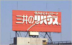
The Mitsui Group's franchise system gave rise to a curiosity: a brand name containing the "no" particle.
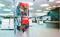
This CI project resulted in the unification of two separate systems for the sale and purchase of houses, and the establishment of the first model showroom based on the new system in Shinjuku. (co-designer Masanori UMEDA)
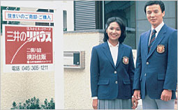
In order to revamp the industry that was widely held to be "slap-shod", PAOS designs incorporated a sense of rigorousness and responsibility that encompassed all aspects of the company's real estate sales business, including its "Uniform" and "Sign System".
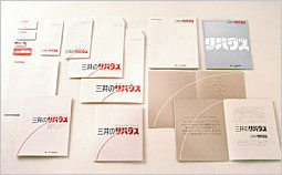
The concept books and stationery were designed to conjure images of the improvements in an individual's living environment that would result from moving at critical stages in life.
![]()
![[method] The PAOS Method](../common/images/workMenu/method.gif)
![[study] PAOS' Research and Application Projects](../common/images/workMenu/study.gif)